Project 3: Play With Colours
Apply your knowledge to build something amazing!
Play With Colours
ℹ️ Project Overview Difficulty Level: Beginner
Estimated Time: One.5 - 2 hours
Skills Practiced:
- SvelteKit component creation
- Reactive programming with Svelte
- Color theory and RGB/HEX conversion
- Event handling and user input
- CSS styling and animations
- Real-time UI updates
Project Roadmap 🗺️
- 🔧 Create Variables - Create the variables
- 🎯 Build Interface - Create the interface
- 🎨 Add Styling - Apply CSS to make it look professional
- ✨ Advanced Features - Add extra functionality
- 🚀 Submit Project - Submit your completed project
- 🎨 Project Setup - Configure initial project settings
Guidelines
Mini Project Guidelines
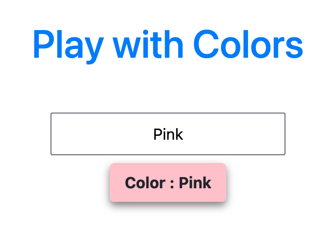
In this lesson, we will be creating an interactive Play With Colours app using SvelteKit. You'll learn how colors work in web development and create a fun tool that helps you explore the RGB color space!
Here's an example of the finished project:
💡 What You'll Build A fully interactive color picker that:
- Shows real-time color changes as you adjust RGB values
- Converts between RGB and HEX color formats
- Includes preset color buttons for quick selection
- Features smooth animations and a professional design
Project Setup
Download Template
Quick Start (Choose One):
-
StackBlitz (Online): 🚀 Open in StackBlitz
-
GitHub (Local):
bashgit clone https://github.com/academic-telebort/Web-3-Project-3-Play-With-Colours.git cd Web-3-Project-3-Play-With-Colours ./setup.sh -
Local ZIP: Download
W3-Template-project-03-colours.zip, extract, then run./setup.sh
💡 Tip The
setup.shscript handles dependency installation and server startup automatically
💡 Project Structure
csssrc/ ├── lib/ ← Your components go here ├── routes/ ← Main page files └── app.html ← Don't modify this
WARNING: Before You Start
DO NOT DELETE the existing files in the template
ONLY EDIT the necessary files in src/
Implementation Overview
In this project, we will:
- 🎨 Create color input fields for RGB values
- 🔄 Display the resulting color in real-time
- 🔢 Show the color values and hex code
- 🖱️ Create an interactive color picker interface
Step-by-Step Implementation
Step One: Create Variables
First, let's understand what RGB means and create our color variables:
ℹ️ Understanding RGB RGB stands for Red, Green, Blue - the three primary colors of light:
- Each color channel has a value from 0 to 255
- 0 = no color (dark)
- 255 = full color (bright)
- Combining all three creates millions of colors!
Create variables to store the RGB color values:
ini
let red = 0;
let green = 0;
let blue = 0;
💡 Why Start at 0? Starting all colors at 0 creates black (no light). This gives users a blank canvas to start exploring colors!
🎯 Milestone One: Variables Created
Great job! You've set up your color storage. Let's make them reactive!
Step 2: Create Reactive Color String
Now we'll use Svelte's reactive statements to automatically update our color whenever the RGB values change:
⚠️ Common Mistake Don't forget the
$:symbol! This tells Svelte to recalculate whenever the variables change.
Create a reactive statement to generate the RGB color string:
ini
$: colorString = `rgb(${red}, ${green}, ${blue})`;
$: hexColor = rgbToHex(red, green, blue);
ℹ️ What's Happening Here?
colorStringcreates a CSS-compatible RGB string like "rgb(255, 0, 0)"hexColorwill convert to HEX format like "#FF0000"- Both update automatically when red, green, or blue changes!
Step 3: Create Color Conversion Function
Let's create the helper functions to convert RGB to hexadecimal format:
💡 Understanding HEX Colors HEX colors are another way to represent colors:
- Uses base-16 (0-9 and A-F)
- Format: #RRGGBB
- Example: #FF0000 = Red (255, 0, 0)
Add a function to convert RGB to hexadecimal:
scss
function componentToHex(c) {
    const hex = c.toString(16);
    return hex.length == 1 ? "0" + hex : hex;
}

function rgbToHex(r, g, b) {
    return "#" + componentToHex(r) + componentToHex(g) + componentToHex(b);
}
⚠️ Common Bug Alert! The
hex.length == 1check is crucial! Without it:
- Color value 15 -> "F" (wrong: should be "0F")
- Color value 255 -> "FF" (correct) Always pad single digits with a leading zero!
🎯 Milestone 2: Color Logic Complete
Excellent! Your color conversion functions are ready. Time to build the interface!
Step 4: Create the HTML Interface
Now let's create an interactive interface where users can adjust colors:
💡 Accessibility Tip Always include labels for your inputs! This helps screen readers and makes your app more user-friendly.
Create the user interface with color sliders and display:
ini
<div class="container">
    <h1>Play With Colours</h1>

    <div class="color-controls">
        <div class="slider-group">
            <label for="red">Red: {red}</label>
            <input
                id="red"
                type="range"
                min="0"
                max="255"
                bind:value={red}
                class="slider red-slider"
            />
        </div>

        <div class="slider-group">
            <label for="green">Green: {green}</label>
            <input
                id="green"
                type="range"
                min="0"
                max="255"
                bind:value={green}
                class="slider green-slider"
            />
        </div>

        <div class="slider-group">
            <label for="blue">Blue: {blue}</label>
            <input
                id="blue"
                type="range"
                min="0"
                max="255"
                bind:value={blue}
                class="slider blue-slider"
            />
        </div>
    </div>

    <div class="color-display" style="background-color: {colorString}">
        <div class="color-info">
            <p>RGB: {colorString}</p>
            <p>HEX: {hexColor}</p>
        </div>
    </div>

    <div class="preset-colors">
        <button on:click={() => setColor(255, 0, 0)}>Red</button>
        <button on:click={() => setColor(0, 255, 0)}>Green</button>
        <button on:click={() => setColor(0, 0, 255)}>Blue</button>
        <button on:click={() => setColor(255, 255, 0)}>Yellow</button>
        <button on:click={() => setColor(255, 0, 255)}>Magenta</button>
        <button on:click={() => setColor(0, 255, 255)}>Cyan</button>
        <button on:click={() => setColor(0, 0, 0)}>Black</button>
        <button on:click={() => setColor(255, 255, 255)}>White</button>
    </div>
</div>
ℹ️ Code Breakdown
- Range inputs: Create sliders from 0-255 for each color
- bind:value: Two-way binding keeps variables and sliders in sync
- style attribute: Applies the color in real-time to the display box
- Preset buttons: Quick access to common colors
Step 5: Add Preset Color Function
Let's add functionality for the preset color buttons:
ini
function setColor(r, g, b) {
    red = r;
    green = g;
    blue = b;
}
💡 Keep It DRY DRY = Don't Repeat Yourself! This single function handles all preset colors instead of writing separate functions for each button.
🎯 Milestone 3: Interface Complete
Amazing! Your color picker is now functional. Let's make it beautiful!
Step 6: Add Styling
Time to make your color picker visually appealing with CSS:
⚠️ Styling Best Practice Use CSS variables for consistent theming! This makes it easier to maintain and update your styles later.
Add CSS styling to make the color picker attractive:
php-template
<style>
    .container {
        max-width: 600px;
        margin: 50px auto;
        padding: 20px;
        font-family: Arial, sans-serif;
        text-align: center;
    }

    h1 {
        color: #333;
        margin-bottom: 30px;
    }

    .color-controls {
        margin: 30px 0;
    }

    .slider-group {
        margin: 20px 0;
    }

    .slider-group label {
        display: block;
        margin-bottom: 10px;
        font-weight: bold;
        font-size: 16px;
    }

    .slider {
        width: 100%;
        height: 20px;
        border-radius: 10px;
        outline: none;
        -webkit-appearance: none;
    }

    .red-slider {
        background: linear-gradient(to right, #000, #ff0000);
    }

    .green-slider {
        background: linear-gradient(to right, #000, #00ff00);
    }

    .blue-slider {
        background: linear-gradient(to right, #000, #0000ff);
    }

    .slider::-webkit-slider-thumb {
        -webkit-appearance: none;
        appearance: none;
        width: 25px;
        height: 25px;
        border-radius: 50%;
        background: #fff;
        border: 2px solid #333;
        cursor: pointer;
    }

    .color-display {
        width: 300px;
        height: 200px;
        margin: 30px auto;
        border: 2px solid #333;
        border-radius: 10px;
        display: flex;
        align-items: center;
        justify-content: center;
        position: relative;
    }

    .color-info {
        background: rgba(255, 255, 255, 0.9);
        padding: 15px;
        border-radius: 5px;
        border: 1px solid #ddd;
    }

    .color-info p {
        margin: 5px 0;
        font-weight: bold;
        color: #333;
    }

    .preset-colors {
        margin: 30px 0;
    }

    .preset-colors button {
        margin: 5px;
        padding: 10px 15px;
        border: none;
        border-radius: 5px;
        cursor: pointer;
        font-weight: bold;
        color: white;
        transition: transform 0.2s;
    }

    .preset-colors button:hover {
        transform: scale(1.05);
    }

    .preset-colors button:nth-child(1) { background-color: red; }
    .preset-colors button:nth-child(2) { background-color: green; }
    .preset-colors button:nth-child(3) { background-color: blue; }
    .preset-colors button:nth-child(4) { background-color: yellow; color: black; }
    .preset-colors button:nth-child(5) { background-color: magenta; }
    .preset-colors button:nth-child(6) { background-color: cyan; color: black; }
    .preset-colors button:nth-child(7) { background-color: black; }
    .preset-colors button:nth-child(8) { background-color: white; color: black; border: 1px solid #ccc; }
</style>
💡 CSS Gradient Sliders The gradient backgrounds on the sliders give users a visual preview of what they're selecting. This improves the user experience significantly!
🎯 Milestone 4: Styling Complete
Fantastic work! Your color picker now looks professional and engaging.
Example Results
Here are some examples of different color combinations you can create:
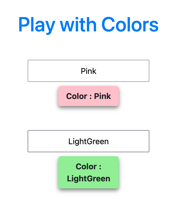
ℹ️ Try These Combinations!
- Sunset Orange: RGB(255, 94, 77)
- Ocean Blue: RGB(0, 119, 190)
- Forest Green: RGB(34, 139, 34)
- Royal Purple: RGB(102, 51, 153)
Debugging Tips
⚠️ Common Issues & Solutions Problem: Colors not updating when moving sliders
- Solution: Check that you're using
bind:valuecorrectly- Debug: Add
console.log(red, green, blue)in your reactive statementProblem: HEX color showing undefined
- Solution: Make sure
rgbToHexfunction is defined before calling it- Debug: Check function names match exactly (case-sensitive!)
Problem: Preset buttons not working
- Solution: Verify
on:clicksyntax and function parameters- Debug: Add
console.log('Button clicked!', r, g, b)in setColor functionProblem: Sliders look plain/unstyled
- Solution: Check that your
<style>tag is properly closed- Debug: Inspect element in browser DevTools
Advanced Features
Ready to take your color picker to the next level? Try these enhancements:
Random Color Generator
Add some excitement with a random color button:
ini
function randomColor() {
    red = Math.floor(Math.random() * 256);
    green = Math.floor(Math.random() * 256);
    blue = Math.floor(Math.random() * 256);
}
💡 Make It Fun! Add this button to your interface:
html<button on:click={randomColor}>🎲 Random Color!</button>
Color History
Create a feature to save and recall your favorite colors:
ini
let colorHistory = [];

function saveColor() {
    const color = { red, green, blue, hex: hexColor };
    colorHistory = [color, ...colorHistory.slice(0, 9)]; // Keep last 10 colors
}

function loadColor(color) {
    red = color.red;
    green = color.green;
    blue = color.blue;
}
ℹ️ Implementation Tip Display your color history as clickable swatches:
html\{#each colorHistory as color\} <div class="color-swatch" style="background-color: rgb(\{color.red\}, \{color.green\}, \{color.blue\})" on:click=\{() => loadColor(color)\} ></div> \{/each\}
Extension Challenges
ℹ️ 🚀 Level Up Your Project!
Beginner Challenges
- Color Names: Add a feature that shows common color names (e.g., "This looks like: Sky Blue")
- Copy to Clipboard: Add buttons to copy RGB or HEX values
- Keyboard Controls: Use arrow keys to adjust color values
Intermediate Challenges
- Color Harmonies: Show complementary, triadic, or analogous colors
- Gradient Creator: Allow users to create gradients between two colors
- Color Blindness Simulator: Show how colors appear to color-blind users
Advanced Challenges
- Color Palette Generator: Create full color palettes based on a single color
- Export Feature: Save color palettes as CSS variables or JSON
- HSL Support: Add HSL (Hue, Saturation, Lightness) sliders
- Animation Mode: Create smooth color transitions over time
🎯 Milestone 5: Advanced Features Added
You're becoming a color expert! These features make your app truly professional.
Code Review
Play With Colours (Code Review)

💡 Before Watching Try to complete the project on your own first! The code review is most helpful when you can compare your solution with the instructor's approach.
AI Prompts
Use these prompts to enhance your color app with AI assistance:
ℹ️ 💡 Smart AI Prompts
For Debugging Help:
- "My color sliders aren't updating the display. Here's my code: [paste code]. What might be wrong?"
- "How can I fix the HEX conversion showing 'undefined' in my Svelte component?"
For Feature Enhancement:
- "Add a color palette generator that creates complementary colors based on color theory"
- "Create a color blindness simulator to test accessibility for different types of color blindness"
- "Add the ability to save and export color palettes as CSS variables or JSON format"
- "Implement a color picker that uses HSL (Hue, Saturation, Lightness) instead of RGB"
For Code Optimization:
- "How can I optimize my color conversion functions for better performance?"
- "Suggest ways to make my color picker more accessible for keyboard users"
Project Checklist
Before submitting, make sure you've completed:
⚠️ Final Checklist
- RGB sliders work correctly (0-255 range)
- Color display updates in real-time
- RGB values are shown on screen
- HEX color code is displayed correctly
- All preset color buttons work
- Styling looks professional and clean
- Code is properly formatted and commented
- Project runs without errors in the browser
- You've tested on different screen sizes
Project Submission
🎯 Final Milestone: Ready to Submit!
Congratulations on completing the Play With Colours project! You've learned:
- ✅ How to work with reactive variables in Svelte
- ✅ Color theory and RGB/HEX conversion
- ✅ Creating interactive UI components
- ✅ Real-time data binding
- ✅ CSS styling techniques
When you have completed your project, submit it using the link below:
💡 Submission Tips
- Test all features one more time
- Make sure your StackBlitz project is saved
- Copy your project URL before submitting
- Include any creative features you added in the submission notes!
Make sure to test your webpage before submitting to ensure all required elements are working properly!
ℹ️ What's Next? After submitting, consider:
- Sharing your color picker with friends
- Adding it to your portfolio
- Trying the extension challenges
- Moving on to the next project!