Activity 10: Bootstrap Grid
Practice and reinforce the concepts from Lesson 10
Bootstrap Grid
What you'll learn
- How to use Bootstrap's container types (
.containervs.container-fluid) - Creating responsive layouts with the 12-column grid system
- Using breakpoint classes for different screen sizes
- Building complex layouts with nested rows and columns
- Best practices for mobile-first responsive design
💻 Activity Setup
Time estimate: 5 minutes
Download your material
- Open StackBlitz and access the template: Open in StackBlitz
Bootstrap Grid System
stackblitz-starters-dm1mranu - Alternative option: Download the source code template from Stackblitz Download Project button if you want to use your own IDE
⚠️ Important: Before You Start DO NOT DELETE the existing files in the template:
- Package files
- Any other files you didn't create
ONLY EDIT the necessary files.
In this activity, you will learn and practice Bootstrap's powerful grid system through hands-on challenges. You'll understand how to create responsive layouts using containers, rows, and columns that adapt to different screen sizes.

💻 Steps to Complete Your Bootstrap Grid Challenge
Total time estimate: 45-60 minutes
Step One: Set Up Your Project
Time estimate: 5 minutes
- Open the provided StackBlitz project link
- Click the preview button to open your
index.htmlpage in a new window - Verify that Bootstrap is properly linked in your project (check the
<head>section)
💡 Tip Always preview your work in a new window to properly test responsive behavior. Use the browser's developer tools to simulate different device sizes!
Step 2: Understand Bootstrap Grid Fundamentals
Time estimate: 10 minutes
Study these key concepts:
- Containers:
.container= fixed-width with responsive breakpoints.container-fluid= full-width at all screen sizes
- Rows:
.rowcreates horizontal groups of columns - Columns:
.col-*defines column width and responsiveness
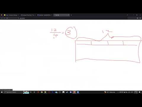
💡 Tip: Remember the 12-Column Rule Bootstrap's grid system is based on a 12-column layout. Your columns in each row should add up to 12!
Step 3: Practice Container Types
Time estimate: 10 minutes
- Create a section with
.containerclass - Create another section with
.container-fluidclass - Add different background colors to see the width differences
- Resize your browser window to observe how each container type responds
💡 Tip Use your browser's developer tools (F12) to see exact pixel widths at different screen sizes.
Step 4: Master Grid Breakpoints
Time estimate: 10 minutes
Practice using responsive grid classes:
.col--> Extra small screens (``phones < 576``px).col-sm--> Small screens (``tablets >= 576``px).col-md--> Medium screens (``desktops >= 768``px).col-lg--> Large screens (>= 992px).col-xl--> Extra large screens (>= 1200px)
💡 Tip: Mobile-First Approach Start with mobile classes (
.col-) and add larger breakpoints as needed. This ensures your layout works on all devices!
Step 5: Create Complex Layouts
Time estimate: 15 minutes
Build these layout patterns:
- Equal-width columns: Use
.colfor automatic sizing - Specific-width columns: Use numbers like
.col-6,.col-4,.col-3 - Mixed responsive columns: Combine classes like
.col-12 .col-md-6 .col-lg-4 - Nested layouts: Place rows inside columns for complex designs
💡 Tip: Common Layout Patterns
- Header:
.col-12- Sidebar + Content:
.col-md-3+.col-md-9- Three equal columns:
.col-md-4(x3)- Four cards:
.col-6 .col-lg-3(x4)
Step 6: Follow the Container Challenge
Time estimate: 10 minutes
- Open the Container Challenge Presentation
- Complete each task shown in the presentation
- Test your implementation after each task
Step 7: Review and Test Your Work
Time estimate: 5 minutes
- Watch the
 video
video - Test your layouts at these screen sizes:
- Mobile: 320px - 576px
- Tablet: 576px - 768px
- Desktop: 768px and above
- Fix any issues you find
✅ Required Elements
Your Bootstrap Grid project must include:
- ✓ Proper Bootstrap grid structure with containers, rows, and columns
- ✓ Use of both
.containerand.container-fluidexamples - ✓ Responsive grid classes for different screen sizes
- ✓ At least one complex layout with nested rows/columns
- ✓ Proper column sizing that adds up to 12 per row
- ✓ Examples of different responsive breakpoints in action
- ✓ Clean, well-organized HTML structure
- ✓ Working responsive behavior when resizing browser
📚 Additional Resources
🎯 Troubleshooting Common Issues
Columns not aligning properly
- Check that your columns add up to 12 in each row
- Make sure you have a
.rowwrapper around your columns - Verify you're not mixing Bootstrap versions
Container not working as expected
- Ensure Bootstrap CSS is properly linked
- Check for typos in class names (
.containernot.contianer) - Clear your browser cache if changes aren't showing
Responsive classes not working
- Test in a real browser window, not just developer tools
- Check the order of your responsive classes (mobile-first)
- Make sure you're using the correct breakpoint prefixes
ℹ️ Info Project Submission When you have completed your "Bootstrap Grid" project, submit it using the link below:
Before submitting:
- Test all responsive breakpoints
- Verify columns add up to 12
- Check both container types work correctly
- Test on mobile and desktop views