Concept 8: Clustering
Clustering
:dart: Learning Objectives
By the end of this lesson, you will be able to:
- Understand what clustering is and why we use it
- Explain how K-Means clustering works
- Implement K-Means clustering in Python
- Find the best number of clusters using the elbow method
- Create visualizations of clustered data
:information_source: Clustering is a type of unsupervised learning that groups similar data points together. Think of it like sorting your toys into different boxes - cars in one box, dolls in another, and blocks in a third box!
Clustering is one of the most popular types of unsupervised machine learning algorithms.
In clustering, we divide data into different groups. Data points in the same group are more similar to each other than to points in other groups.
:bulb: Think of clustering like organizing students into study groups. Students with similar interests or skills work together in the same group!
Clustering helps us find patterns in data without being told what to look for. The algorithm discovers the groups on its own!
In this chapter, we'll learn about K-Means Clustering, one of the most popular clustering algorithms.
:mag: What is K-Means Clustering?
:information_source: K-Means Clustering divides your data into K groups (clusters) based on similarities. The "K" in K-Means tells us how many groups we want to create.
During K-Means Clustering:
- Similar data points go into the same cluster
- Different data points go into different clusters
The letter 'K' represents the number of clusters we want to create. You get to choose this number!
Let's see an example with x and y coordinates:
When K = 2, the following clusters will be formed:
When K = 3, the following clusters might be formed:
note As data scientists, we need to find the best K value for our data. We'll learn how to do this later!


:rocket: How K-Means Clustering Works
Let's walk through the K-Means process step by step. We'll use K = 2 for this example.
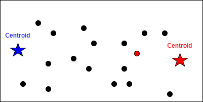
Step One: Place Random Centroids
First, we randomly place K points on our graph. These special points are called centroids (think of them as team captains!).

Step 2: Calculate Distances
Next, we calculate the distance from each data point to each centroid.

Step 3: Assign Points to Nearest Centroid
Each data point joins the team of its nearest centroid!
We assign all data points to their closest centroid:

Step 4: Move Centroids to Center
Now we move each centroid to the actual center of its cluster:

Step 5: Repeat Until Stable
We repeat steps 2-4 until the centroids stop moving:

Step 6: Classify New Data
When new data arrives, we check which centroid it's closest to:

:bulb: The algorithm keeps repeating until the centroids find their perfect spots - like musical chairs where everyone finally sits down!
:computer: Implementing K-Means in Python
Let's learn how to use K-Means Clustering with Python and Scikit-Learn!
Step One: Prepare Your Data
Your dataset needs to be a 2D numpy array (like a table with rows and columns):
pythondata = np.array([[3.2], [5.0], [3.4], [1.0], [9.9], [12.0], [2.2], [1.9]])If your data is a 1D array, use reshape to make it 2D:
pythondata = np.array([3.2, 5.0, 3.4, 1.0, 9.9, 12.0, 2.2, 1.9]) data = data.reshape(-1,1)Step 2: Import KMeans
pythonfrom sklearn.cluster import KMeansStep 3: Create Your Model
Create a KMeans model with your chosen number of clusters:
pythonkmeans = KMeans(random_state=42, n_clusters=2)Step 4: Train the Model
Fit your data to the model (no labels needed - it's unsupervised!):
pythonkmeans.fit(data)Step 5: Explore Your Results
Find the centroid locations:
pythonkmeans.cluster_centers_Check the model's inertia (how well it clustered):
pythonkmeans.inertia_Step 6: Make Predictions
Predict which cluster a new point belongs to:
pythonkmeans.predict([[3.2]])Expected output:
iniarray([0], dtype=int32)note The output tells us this data point belongs to cluster 0!
:bar_chart: Visualizing Your Clusters
Let's create beautiful graphs to see our clusters!
Step One: Import Matplotlib
python
import matplotlib.pyplot as plt
Step 2: Get Cluster Labels
Find out which cluster each data point belongs to:
python
labels = kmeans.predict(data)
Step 3: Separate Data by Cluster
Group your data points by their cluster:
python
cluster0 = data[labels == 0]
cluster1 = data[labels == 1]
Step 4: Create a Basic Plot
Plot each cluster with different colors:
python
# Plotting the clusters
plt.scatter(cluster0[:,0], cluster0[:,1])
plt.scatter(cluster1[:,0], cluster1[:,1])
plt.show()

Step 5: Add Centroids
Show the centroids as special markers:
python
# Plotting clusters with centroids
plt.scatter(cluster0[:,0], cluster0[:,1])
plt.scatter(cluster1[:,0], cluster1[:,1])
plt.scatter(kmeans.cluster_centers_[:,0], kmeans.cluster_centers_[:,1])
plt.show()

Step 6: Add Labels and Legend
Make your graph easy to understand:
python
# Plotting with legend
plt.scatter(cluster0[:,0], cluster0[:,1], label='Cluster 0')
plt.scatter(cluster1[:,0], cluster1[:,1], label='Cluster 1')
plt.scatter(kmeans.cluster_centers_[:,0], kmeans.cluster_centers_[:,1], label='Centroids')
plt.legend()
plt.show()

:bulb: Use different colors and markers to make your clusters stand out! This helps others understand your data better.
:dart: Finding the Best K Value
How do we know how many clusters to use? Let's learn about inertia!
:information_source: Inertia measures how tightly packed our clusters are. It's like measuring how close friends stand together in a group photo!
Here's what you need to know about inertia:
- Lower inertia = Better clustering (points are closer to their centroids)
- More clusters = Lower inertia (but too many clusters isn't always better!)
- Inertia is calculated by measuring distances between data points and their centroids
We can use inertia to find the ideal number of clusters.
Number of Clusters, k Inertia 2 200 3 150 4 50 5 45 Look at the pattern - as K increases, inertia decreases!
What Makes a Good Model?
A good clustering model balances two things:
- Few clusters (simpler is better!)
- Low inertia (tight, well-defined groups) note It's like organizing a party - you want enough tables for people to sit comfortably, but not so many that friends are spread too far apart!
The Elbow Method
The elbow method helps us find the perfect balance. We plot inertia against the number of clusters:

The best K value is at the "elbow" - where the line bends like an arm! After this point, adding more clusters doesn't help much.

:bulb: Look for where the graph makes a sharp turn - that's your elbow! In this example, it's at K=2.
:computer: Implementing the Elbow Method
Let's write code to find the best K value automatically!
Step One: Import KMeans
pythonfrom sklearn.cluster import KMeansStep 2: Create Storage for Results
Store inertia values for different K values:
pythonlist_of_inertia = []Step 3: Test Different K Values
Try different numbers of clusters:
pythonfor k in range(1, 5): model = KMeans(random_state=42, n_clusters=k) model.fit(data) list_of_inertia.append(model.inertia_)Step 4: Create the Elbow Plot
Visualize the results:
pythoncluster_df = pd.DataFrame({'Cluster':range(1,6), 'inertia':list_of_inertia}) plt.plot(cluster_df['Cluster'], cluster_df['inertia']) plt.xlabel('Number of clusters') plt.ylabel('Inertia') plt.show()
Step 5: Find the Elbow
Look for the bend in the graph:
The elbow is at K=2 - that's our ideal number of clusters!
:memo: Summary
Let's review what we learned about clustering:
- Clustering groups similar data points together without labels (unsupervised learning)
- K-Means is a popular clustering algorithm that creates K groups
- The algorithm works by:
- Placing random centroids
- Assigning points to nearest centroid
- Moving centroids to cluster centers
- Repeating until stable
- Inertia measures how well-clustered our data is
- The elbow method helps us find the best K value
- We can visualize clusters using matplotlib
Video
AI Prompt
Code with AI: Try using AI to understand clustering.
Prompts:
- "Explain how the K-Means clustering algorithm works."
- "Write Python code to implement K-Means clustering using scikit-learn."
:video_game: Practice Time!
Try these exercises to master clustering:
Experiment with K Values: Create a dataset and try different K values. What happens when K is too small? Too large?
Real-World Application: Think of three real-world examples where clustering would be useful (hint: customer segmentation, image compression, etc.)
Code Challenge:
- Create a dataset with 3 clear groups
- Use K-Means to find these groups
- Plot the results with different colors
- Use the elbow method to verify K=3 is best
Critical Thinking: Why might clustering fail? What kinds of data shapes would be hard for K-Means to cluster correctly? tip Remember: The best way to learn clustering is by experimenting with different datasets and seeing the results visually!