Concept 2: Design Principles Part 1 Color Theory
Design Principles Part 1 - Color Theory
Agenda
- Basics of Color Theory
- Color Harmony and Palettes
- Psychological Impact of Colors
- Color Accessibility in Design
- Applying Color Theory in Figma
Introduction to Color Theory
Definition: Color theory is the collection of rules and guidelines regarding the use of color in art and design.
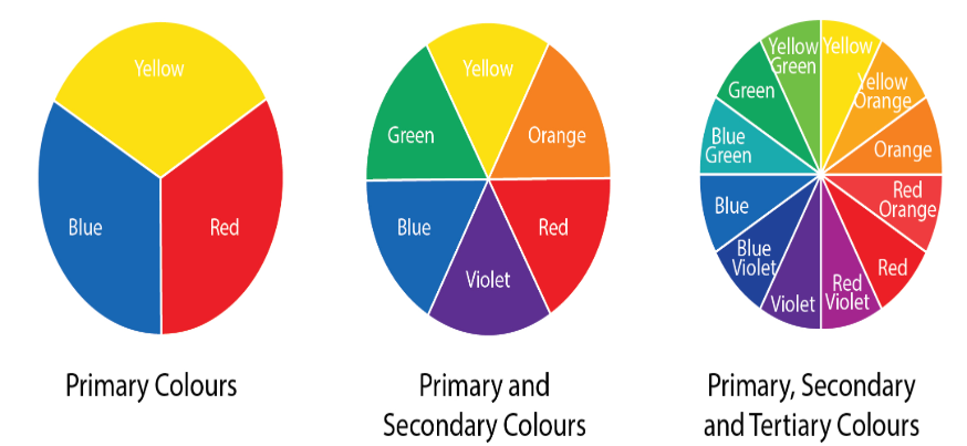
The Color Wheel
Primary Colors: Red, Blue, Yellow
Secondary Colors: Green, Orange, Purple (created by mixing primary colors)
Tertiary Colors: Combinations of primary and secondary colors
Color Harmony
- Complementary: Colors directly opposite each other on the color wheel.
- Split complementary: A base color plus the two colors on either side of its complement.
- Analogous: Colors that sit next to each other on the color wheel.
- Triadic: Three colors evenly spaced around the color wheel.
- Tetradic: Four colors forming a rectangle (two complementary pairs) on the wheel.
- Square: Start with key color to start then identify the other colors that are equidistant (Square)
- Monochromatic: Different shades and tints of a single color.

Color Properties

Psychological Impact of Colors
| Type | Colors | Impact |
|---|---|---|
| Warm Colors | Red, orange, yellow | Energy, Warmth |
| Cool colors | Blue, Green, Purple | Calm, Trust, Peace |
| Neutral colors | Black, White, Gray | Balance, Sophistication |
Color Associations:
- Red: Passion, urgency
- Blue: Trust, stability
- Green: Growth, health
- Yellow: Happiness, caution
- Purple: Luxury, creativity
Cultural Considerations
Be aware of different meanings in different cultures. A good example is:
- Yellow:
- Good in Thailand - Represents royalty.
- Bad in France (historically) - Used to symbolize betrayal and jealousy.

- White:
- Good in Western - Symbolizes purity, peace, and weddings.
- Bad in some Asia - Associated with mourning, death, and funerals, especially in China and India.

Color Accessibility
- Contrast Ratios: Importance for readability
- WCAG Guidelines:
- Minimum contrast ratio of 4.5:1 for normal text
- Use tools to check contrast (e.g., WebAIM Contrast Checker)
- Designing for Color Blindness:
- Use patterns and textures in addition to color
- Avoid problematic color combinations (e.g., red and green)
Applying Color Theory in UI Design
- Creating a Color Palette:
- Start with a base color reflecting brand identity
- Use color harmony principles to select additional colors
- Best Practices:
- Limit the number of primary colors (usually 2-3)
- Ensure sufficient contrast between text and background
- Test colors on different devices and lighting conditions
Using Color in Figma
- Color Styles:
- Create reusable color styles for consistency
- Organize colors into categories (e.g., primary, secondary, accents)
- Applying Colors:
- Demonstrate how to apply colors to shapes, text, and components
Plugins and Resources
- Introduce Figma plugins like "Color Blind" simulator
- Use resources like Adobe Color for palette inspiration

Case Study - The Use of Color in the Slack Interface
Objective: Analyze how Slack utilizes color to enhance usability, brand identity, and user experience.

Discussion Points:
- How does Slack's color scheme support its brand identity?
- In what ways does the ability to customize colors enhance the user experience?
- How does Slack address accessibility in its use of color?